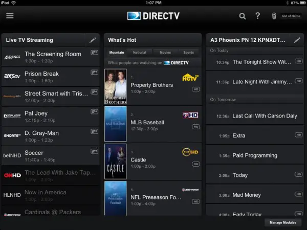
DIRECTV has given its iPad app interface an upgrade. The most substantial improvement for the iOS app was making all content available from a single menu icon up in the left hand corner. The new iOS app also helps you find TV shows and networks easier, and filter out options for what’s available on your iPad and what’s only available on your TV. You can also set up your Home Screen with customizable modules via the Manage Modules button.
One the biggest complaints with the DIRECTV app for iPad was figuring out what is or isn’t available to watch remotely. The new interface has made this easier by adding a new Watch Button in one location where you can opt for viewing on your TV or iPad.
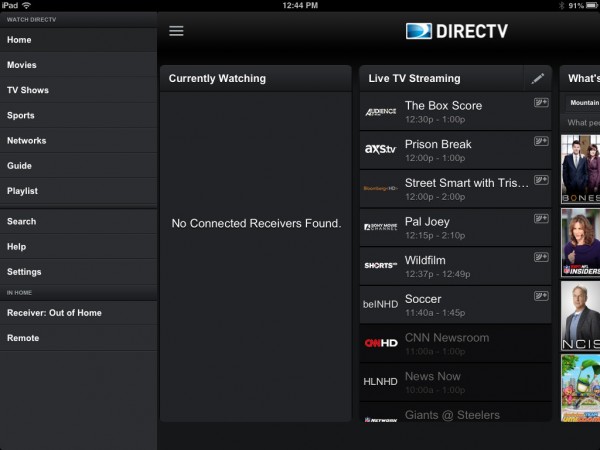
The categories on the main screen have remained the same: “Currently Watching,” “Live Streaming,” and “What’s Hot” are still the big three. However, these all now slide over when you access the new menu icon in the upper left, essentially adding a long vertical navigation. (See pic below.)
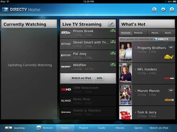
The developers at DIRECTV removed the bottom navigation bar from the previous app version which just added a layer of confusion to the interface. (See before app screenshot below.) That bar included Searching, Remote, Home, Playlist, and Watch on iPad buttons among other options but seems to have been reorganized and moved into the left menu.
It also appears the update has fixed a quirk where the “Currently Watching” section would freeze on the words “Updating Currently Watching” even when your home receiver was clearly off or unavailable. Now, when you are away from your receiver the message promptly indicates “No Connected Receivers Found.”
There are plenty of customization options like adding your favorite channels, including locals, to their own column for quick access. There are also plenty of pre-built categories and listings which you can arrange however you want. Just remember to scroll horizontally.
All-in-all this was a great little update for an app that had some troubles but is now much slicker and intuitive to use. You’ll have download the new app to see the updated interface.
DIRECTV says app updates are headed for iPhone and Android iOS devices as well.





Note to DIRECTV: The “Exit” button on the receiver Remote window does not work. (However, simply clicking on the main window makes it disappear.)
As a long time user of the Ipad App I do not agree with your assessment. The graphical appearance is amateurish and extremely difficult on the eyes. The former App had definition via color in the banners and bolder font color. This App’s guide is a blur with no way to focus on the information. The sidebars and banners have no characteristics to set them apart from the linked content. It looks cheap, hastily written and a throw back to older Windows versions that were trying to mimic Apple. If you were color blind I could perhaps see where one might find some value in the update but it certainly can’t be called an upgrade by today’s standards in App evolution.