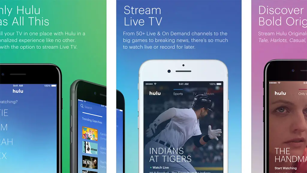
 Version 1.0 of the “Hulu with Live TV” app was released simultaneously with the launch of the company’s over-the-top streaming television product. The $40 per month Live TV service is still in beta mode, and the app for iOS and Android devices may have been as well.
First, the new features.
The app now lets users record Live TV to a Cloud DVR account, watch concurrent streams on multiple devices, manage shows, movies and channels with My Stuff, and track and record games from chosen favorite teams. There’s also a new “onboarding experience” that helps create their own Hulu experience from the start. These are all great additions, but somehow the integration of Live TV seems to have stuck a wrench in the works.
The iOS version.
While some user reviews of the “Hulu with Live TV” app give it 4 to 5 stars, the majority of the reviews since May 3 are irate about the update. “The new UI IS GARBAGE!” said Jason B. “I love Hulu, …but this new update is horrible and confusing,” said another reviewer. One user even says the app makes them seasick.
A majority of the complaints for the iOS version focus on usability, but some also call out problems with the app for iPad such as lack of support for iPad Pro 12.9” as well as a poorly designed UX for Apple TV.
The Android version.
The Hulu app update for Android isn’t any better. One review says the app is the “worst update ever,” while another says the navigation design went from “from classy to kindergarten.”
Taryn K. asks “Why on Earth would you remove the easy to see new episode notification on the face of the shows?” Many other reviews say the old version was much better in terms of usability. “Form follows function” cries another reviewer, further saying that “no design overhaul should ever make something less usable.”
By the way, fake reviews stand out like sore thumbs on both platforms. When a user claims to have instantly “dropped PS Vue for Hulu” you can’t possibly take it seriously.
The design team at Hulu has certainly got their hands full. Some subscribers actually claimed to have cancel their accounts due to the poorly-received update.






I cancelled my subscription after calling customer service and being told Hulu had no intentions of responding to the negative feedback and correcting the UI or returning to the previous one. Disgusting how little value they have for their consumers. I hope others show their frustration with their wallet.
Amazon Video update was a major fail. I canceled Prime.
Now, Hulu decides it wants to fail, too.
Looks like I’ll need to cancel Hulu.
I like the old Hulu.
But, this is painful on the eyes on a large tv.
Lots of flashing, bright colors, needless animation.
48″ with bright flashing colors late at night in a dim room. WTH are they thinking!
The HUGE images make me want to sit in the next room to watch.
No… it makes me watch Netflix, cancel Hulu and save $12 a month. Yea!!!!!
Luckily I was able to retrieve the old APK from my wife’s Android phone and sideload it back to mine. Now I have a usable Hulu experience again. No Hulu TV features, but there is no way I’m going to upgrade to this unusable app.
This was really bad timing for Hulu. There are a lot of new offerings on the market. I’ve been a Hulu subscriber since 2013, so I was planning to simply upgrade to Hulu TV. Now I will give the competition a trial period, and if the Hulu UI is not fixed by the time I make a decision, I’m out.
I definitely agree with the current attitude towards how awful the new UI is. I almost never go out of my way to review an app but the new update was so unusably slow and inefficient that I had to get my laptop to watch my shows and went to write a livid response and change my 5 star rating to a one thats how dreddful it was for me.