 Even though Amazon’s Prime Instant Video service was launched back in February of this year, it seems relevant to do a review of the service as many Netflix customers are considering other options. Amazon’s Instant Video service is built into the Amazon web store, and this may be one of the main reasons it doesn’t feel like a comparable product to specialized services such as Netflix, Vudu, Hulu, and even iTunes.
Let’s start with branding — there is none.
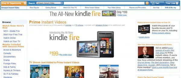
Amazon needs to brand their Prime Instant Video service so users/viewers feel like they are in a different space than the rest of the Amazon shopping website. Take a look a the screenshot below — big ads for the Kindle Fire, buy this, buy that, all placed way above the newly added streaming TV shows list. This doesn’t look like a state-of-the-art streaming service to me. It just looks like ads. If you’ve paid for Amazon Prime, you’re most likely not looking for additional purchases and rentals before you look for the freebies. So why have so many products and on-demand titles mixed into the bunch?
Lack of customer-based navigation.
Where are the “Recently Watched” titles? Where is a “Your Queue” listing? There needs to be a list of recently watched titles clearly visible so viewers can easily navigate back to titles they might want to finish. Who watches a movie all at once these days? Users are always taking breaks, pausing for the next day, or finishing another movie first. User rankings would also be a big help when deciding on which videos to stream.
Video real estate.
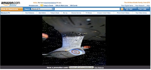
You might find when you click to watch a movie the video window is only taking part of the browser. It looks as if the the vertical space of the movie has been limited to offer more and more Amazon content around the video. Problem is, users just want to watch movies and not be bothered with the rest of the content the site has to offer. You can, however, click the full screen and everything else disappears.

Movie and TV show listings appear limited.
There are links to genres under both categories, but the navigation forces the viewer to dig deep into the organization. Amazon might take a hint from Netflix who presents newly arrived movies first and integrates rollover information above graphics in order to fit more titles on the page.
No ability to choose resolution.
Why not offer users a choice of video resolution? It’s frustrating to start a movie with the titles barely legible. Users should be able to choose from the start. YouTube does a great job of offering different sizes such as 320p, 480p, 720p, and other HD formats. And although the majority of content on YouTube is still pretty junky, the company at least makes an attempt at letting you control the quality.
What about cost?
The cost seems fine. For a yearly fee of $79 you get Amazon’s free two-day shipping on most products, along with the Instant Video service. You might consider the streaming service a “throw-in.” Compare that to Netflix, which costs $7.99 per month or $95.88 per year. If Amazon could match the number of titles Netflix has in their digital library, the decision would be a no-brainer.
To put it simply, Amazon needs to “brand” their Instant Video section so that users feel as if they are getting a movie service, not a haphazard extension of their shopping site. Amazon could learn a lot from Netflix’s interface which has evolved into a easy and even fun place to navigate. Now, should I keep or cancel my Prime trial when it’s over this month?

